ABO Academy
Client
Amway Corp.
My Role
UX/UI Designer
Timeline
2 Years (2023-2025)
Tools
Figma, Adobe Illustrator, Jira


Overview
Designing an educational web app for millions of users across over 100 countries & territories, with the USA & India as the largest markets.
Objective
Replace a legacy, mobile-only native learning feature with a scalable, responsive web application. The intent was to boost accessibility, engagement, and usability across all devices while preserving core functionality.
Key Challenges
- Low Engagement & High Support Costs: Amway’s Creators+ native app housed a dated version of ABO Academy that suffered from poor searchability, high bounce rates, low user satisfaction, and frequent support calls.
- App Friction: Requiring users to download a native app created an unnecessary barrier to entry compared to a web experience.
- Global Scale & Localization: Rolling out worldwide meant designing for diverse cultural preferences, market-specific feature requests, and strict regional regulatory requirements.
The Solutions
- Responsive Redesign: Rebuilt the legacy experience into a fully, seamless, multi-device web app.
- Enhanced Discovery: Introduced intuitive categories, a "What's New" section, and robust search to eliminate user confusion and drop-offs.
- Centralized Dashboard: Designed a unified hub to track learning progress, goals, and personalized content.
- Clear Progression: Streamlined the core loop for users with structured "Learning Paths" which function as playlists for courses/learning materials. Complete with visible progression meters and certificates upon completion to be collected in an awards trophy room as a form of gamification and progress tracking.

Promotional Material for IBO Academy (NA Market ABO Academy)
The Impact: In addition to the increases in productivity and profit generated by better-educated Amway Business Owners, this initiative had a direct impact on contracted-support spending. It also proved to be an overall more engaging and intuitive experience.
How Academy Works
The Core Loop for Users: In its simplest golden path form, the core loop is browsing and accessing course materials to improve their understanding of any given topic. With the inclusion of Learning Paths, Favorites, Achievements, Search, and Profile settings, it gets a bit more complicated.
For the full sitemap; complicate it.

The Dashboard
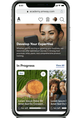
Adding a home page for all content was an important step towards improving usability and helping users find what they were looking for. It was important to me that the section hierarchy reflected the project's goals. Naturally, required courses would be near the top, as those often had something to do with government compliance, but I wanted "In Progress" courses and learning paths placed even before that. One of our primary goals was to get users actually clicking on and finishing materials, and putting their half-finished assignments as the first thing they see when opening the app was an easy win for making that happen. The dashboard also made it easier to see the full breadth of the ABO Academy at a glance, which helps new users intuit the value of the platform and, in turn, helps with engagement.


Categories
There is a lot of content on ABO Academy. Categories help guide users to the specific topics that are meaningful to their personal business goals. I wanted these to stand out visually as different from the many Course and Learning Path cards while scrolling down the dashboard, and a great way to do that was making them visually distinct. I presented a couple of options to my fellow Amway designers as well as my project PM and stakeholders. We decided on leveraging our existing vector art branding we had rights to use. Using that library, I could adjust the colors and shapes of to fit whatever topic we needed. I also got pretty good at just creating whole new images that matched the style using Adobe Illustrator and Figma's built in SVG adjustment options.
Search
A robust search feature is often overlooked in importance, but becomes increasingly valuable as a platform expands. Users do not always have a lot of time to scroll through the interface trying to find exactly what they're looking for. A lot of heavy lifting can be done with features like predictive text, filters for results, and the ability to see how long a learning material will take to complete.
Search in ABO Academy functions as a more direct and deliberate second option to scrolling through the dashboard. A combination of search and dashboard recommendations also helps create a familliar experience to anyone who has used platforms like YouTube, Netflix, or really any streaming service.


Ensuring Accessibility
Users cannot use your product if they cannot see or navigate it. From the very start of the project to the end, I championed WCAG standards. With empathy and clever visual design, you can turn accessibility measures into superior pieces of an experience. Things like screen readability, mouse-free navigation, text/image contrast, and subtitles for videos were always on my mind. Caring about these things does not just open up opportunity for new users and protect a company from legal heat, it also just makes a better product for everyone.
Global Audience
The sheer range of users and countries involved means that there will always be requests for special cases and exceptions made within the design. Different markets have different tastes, customs, and regulatory requirements. For the most part, the strategy held by my Design Director and my PM was to try to keep things as globally consistent as possible, but there were some notable exceptions. It was part of my job to figure out how to translate these special needs into the designs. For example, the Vietnamese release of Academy Web had to adhere to their government's new rules regarding training time. We ultimately implemented a system that forced users to complete a series of required courses before gaining access to the whole site.


Awards & Progression
Measurable progression and achievement are great for driving engagement. There is a simple, low-level gamification that comes with progress bars, trophy rooms, and certificates. While I did not invent awards for the web version of Amway's eLearning platform, my inclusion of a sortable trophy room, and linking achievements back to their content helped improve the experience. With these changes there would always be a convenient way to see just how much a user had accomplished on the site and return to past materials for brushing up or to share with others.
Post Mortem
I learned quite a bit from this initiative. It was eye opening to work directly with people in Malaysia, India, Singapore, Japan, Ukraine, LATAM, and more. It was also enlightening to take part in the design and development of the internal products that make up the backend of ABO Academy, as we needed a robust non-client-facing tool for adjusting things like courses, permissions, and completion statuses. That side of things is not something I was used to thinking about.
There are a couple things I would do differently if I could start from scratch. First, I would have fought harder to get a clear answer from my director on where to draw the line with market-specific concessions. Second, I would have committed to more benchmarking and visual design for the achievements trophy room, as while it serves its purpose beautifully, I do feel like it could be raised to a level that matches the rest of the experience.


Figma Demo
(Open direct link for better experience in new tab)
Interactive demo for the basic course flow. Extraneous navigation is disabled. Click the expand button for the best experience. Scroll up and down on the dashboard until you find the appropriately named "Example Course for Demo."